
When it comes to designing your home, choosing the right colour combinations is crucial. Combining materials that contrast in colour bring both visual interest and harmony to any space. If carefully thought out, applying two (or more) colours can suit all design tastes, but it’s important to understand which colours complement each other to achieve the perfect ambiance and style for your space. Whether you’re renovating your kitchen, bathroom, or hallway, read on to explore how you can incorporate some of our favourite colour combinations that will inspire your next project.
Bold Contrast
Contrasting colours with completely different tones, such as warm and cool or light and dark, can create a visually dynamic and striking space. The contrast between such tones can highlight certain features, create focal points, and evoke a sense of excitement and energy into a room.
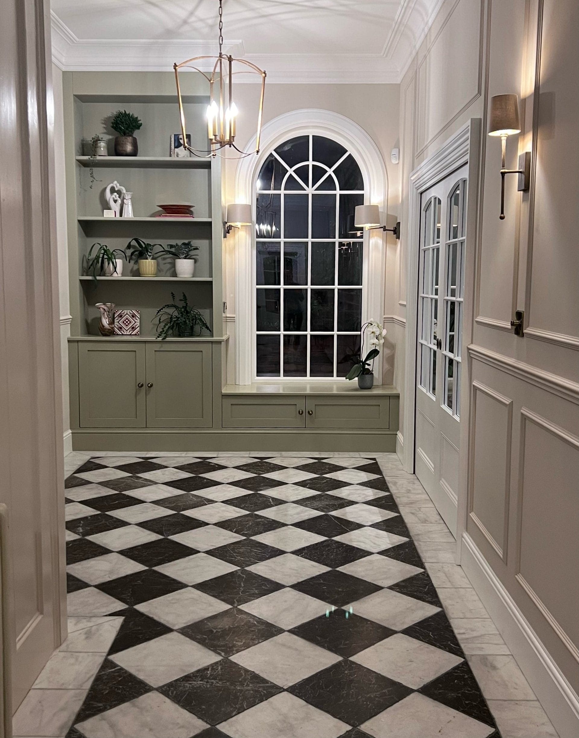
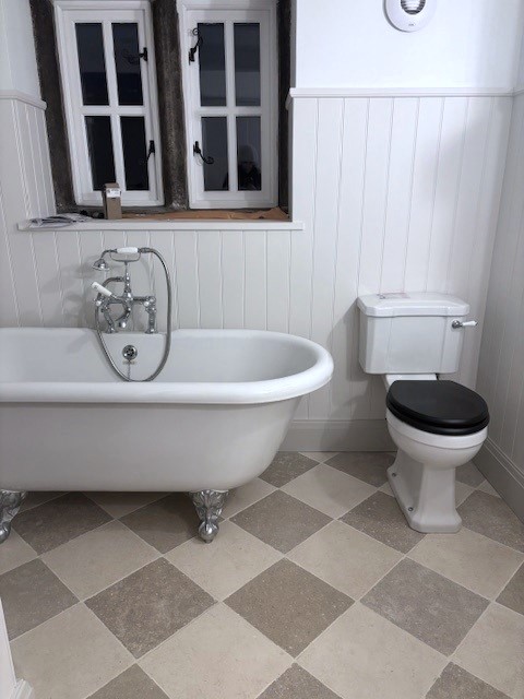
A classic combination, black and white offers sharp contrast and timeless elegance. This pairing can be used to create high drama or sleek, minimalist designs. Whether it’s a black wall with white flooring or a black and white chequer pattern, such as our Venetian Chequer Marble and Dolce/Amazonia Chequer Porcelain, this timeless colour contrast complements both traditional and contemporary design styles.
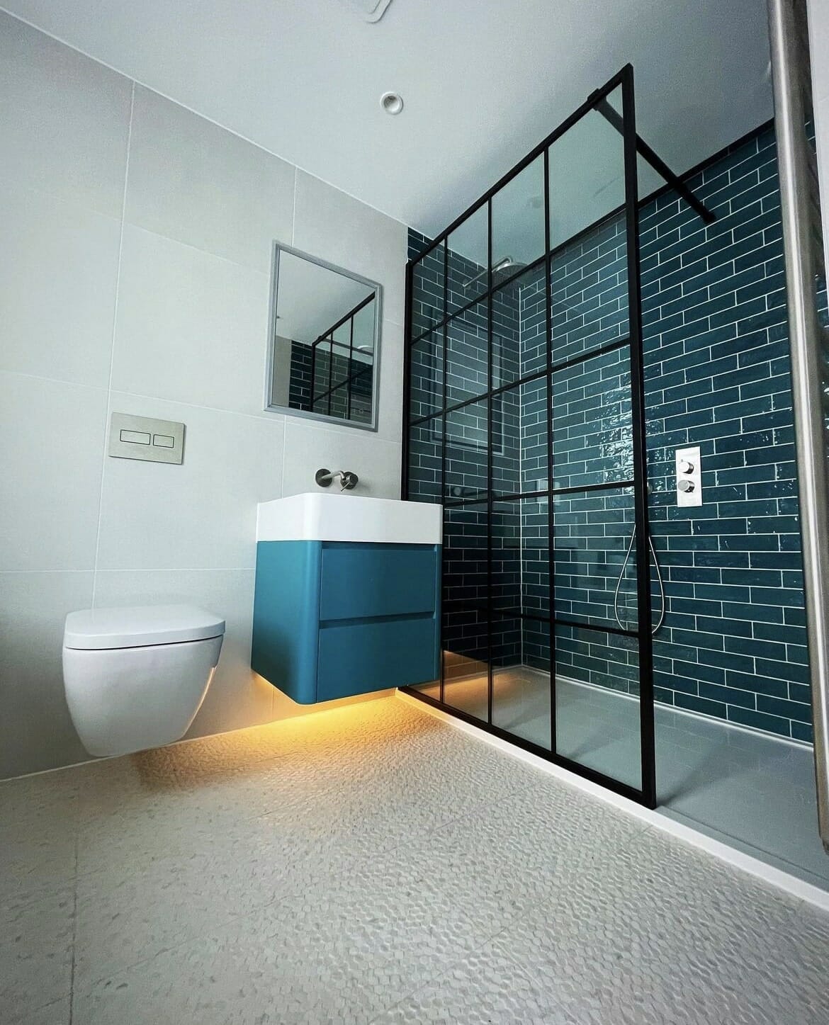
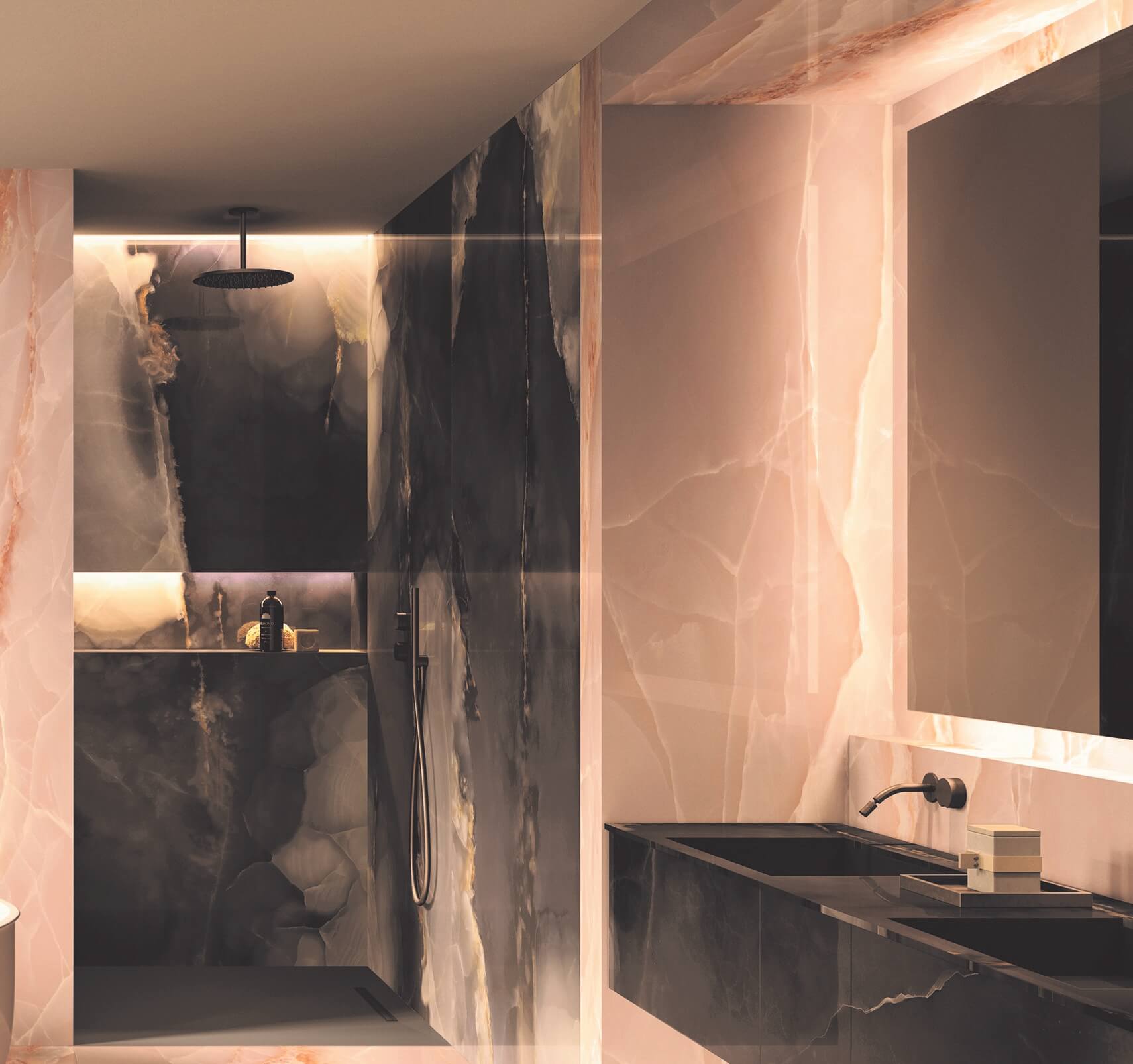
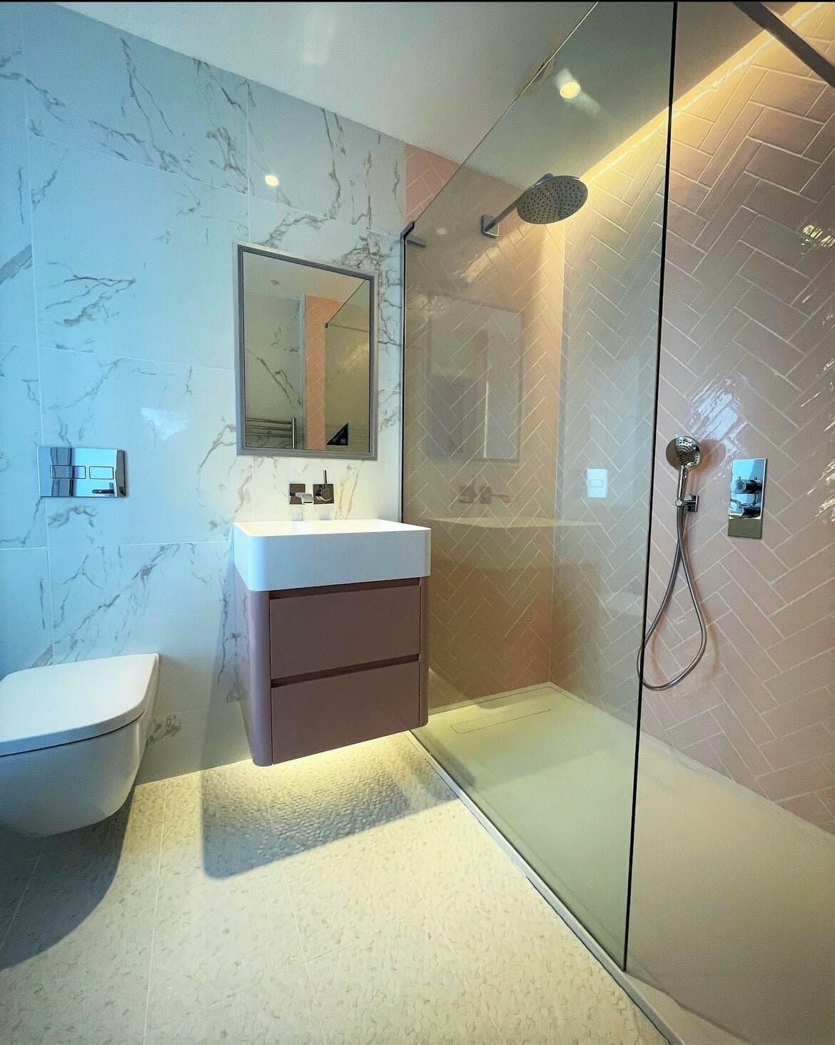
Alternatively, contrasting colours that are located opposite each other on the colour wheel other than the classic black and white, can make an equally striking statement. For example, consider pairing our Onyx Pink and Black tiles, blending the softness and warmth of pink with the sophistication and drama of black. Or, for a more refreshing and versatile contrast, try pairing deep shades of green or blue with a pure white, such as our Colori Petrol Green and White Kit Kat tiles, or our Monaco Azur Blue Ceramic Bricks with Venice White Matt Porcelain tiles.
Neutral & Minimalist
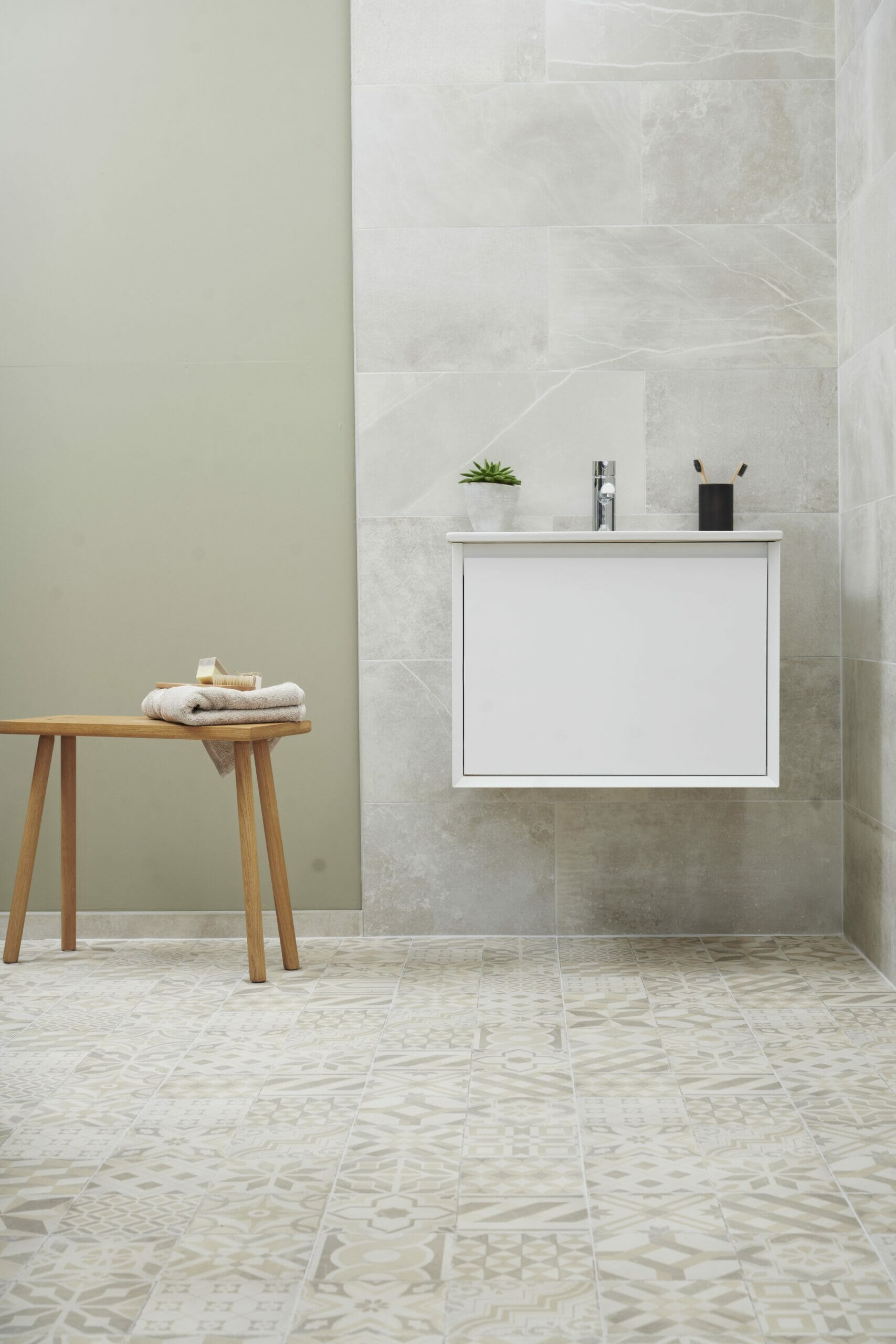
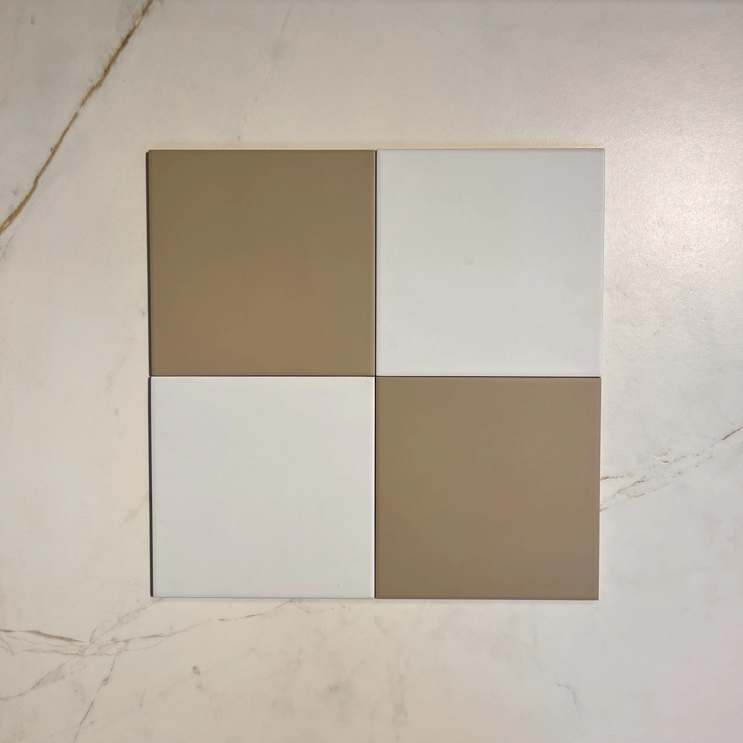
Spacious, clean, and timeless, neutral and minimal colour combinations are perfect for creating calm and serene spaces. These palettes focus on subtle, simple, and understated elegance, allowing other design elements like textiles and furniture to be highlighted. Pairing subtle, warm tones found in products like Geneva Coast Natural Porcelain and Castello Warm Mix, creates a tranquil and inviting space. Adding a pure white shade to pale beige tones creates a space that feels both modern and cosy. The warmth of beige balances the crispness of white, seen in our Victorian Patrona Caramel & Old White Chequer Porcelain, making it ideal for spaces where you want a gentle, relaxed vibe.
Monochrome
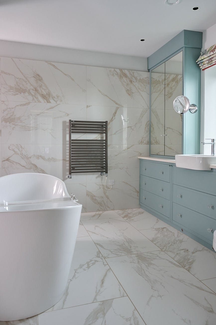
Using varying shades and tones of a single colour throughout a space creates a harmonious and unified look. Focusing on one colour allows other design elements like textiles, lighting, and furniture to add depth and interest without overwhelming the space. Combine shades of blue in our Pastello collection, from deep navy to pale blue tones, to create a calm and rejuvenating space. Or, for a more subtle monochrome design, focus on a greyscale palette, such as Dolce/Khora Grey Modello Porcelain which features pale to deeper grey tones, to create a stylish yet balanced and harmonious space. Highly versatile, monochrome colour schemes can be applied in any room to suit contemporary, minimalist, or traditional interiors.

Earthy & Organic
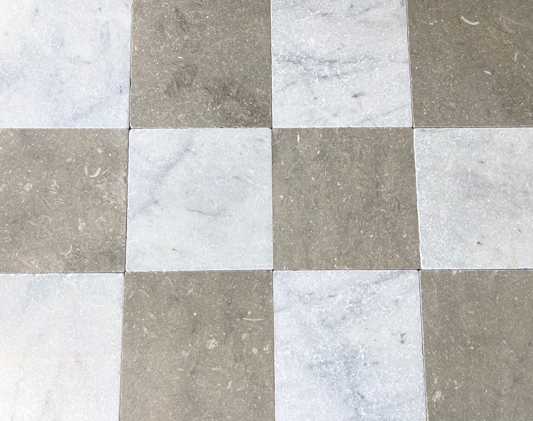
Combining palettes inspired by nature can create a grounded, calming, and natural atmosphere. Bring the outdoors inside by combining deep greens and natural wood tones, found in our Woodland and Norway ranges – the perfect duo to achieve an earthy interior. For a more subtle, organic look, consider creating a chequerboard pattern combining olive green tones, in our Olivestone Tumbled Limestone, with a natural off-white shade in our Carrara Tumbled Marble. This balanced colour palette combines the richness of nature with the softness of neutrals, evoking a sense of calm and sophistication.
Soft Pastels
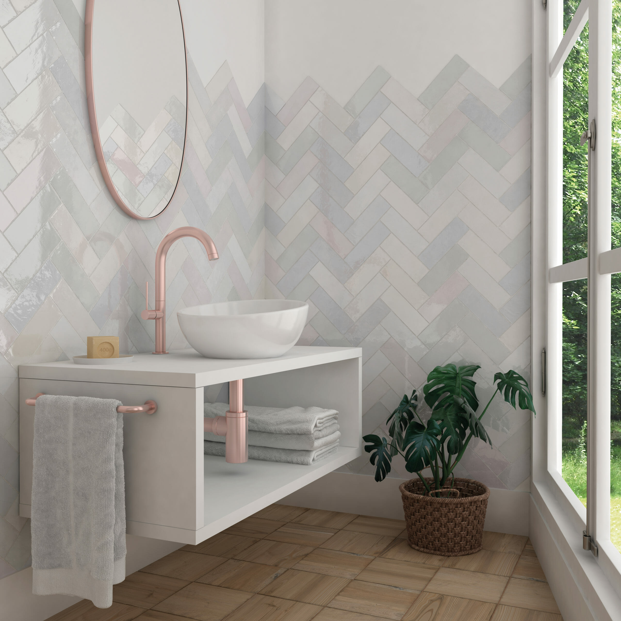
Perfect for creating a serene, calming, and airy atmosphere, these gentle hues are versatile and work beautifully in spaces where you want to evoke a peaceful yet stylish environment. Pastel tones such as blush pinks in our Pastello tiles and Catalan bricks, muted greens in our Monaco Zellige and Majorca bricks, and soft blues in our Monaco and Palos bricks, all work beautifully together. Consider pairing pastel hues with neutral tones like white, grey, or beige, keeping the space feeling light and fresh while letting the pastels shine through.
If you have any questions, please get in touch. We showcase a number of our tiles on Facebook, Instagram, X and Pinterest pages. Be sure to follow us for offers, ideas and much more. You can also request a free brochure on our website.